Case Studies
Tons of Data
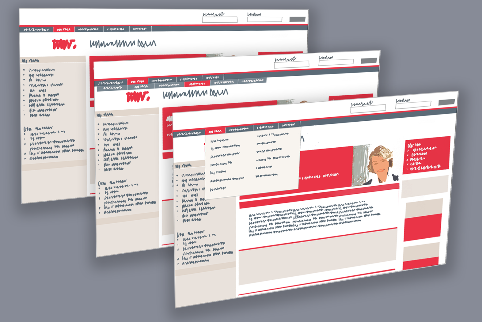
How do you create a tool for massaging, cleaning, manipulating and using data?
Start with the users.
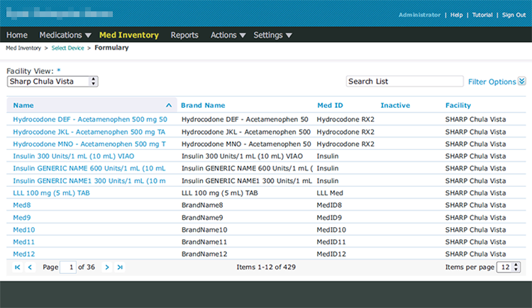
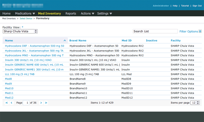
The data in question is pretty straightforward; names, addresses, specialties, networks, licenses, statuses, and closely related bits.
There are many data handling apps out there but the client had not been able to find one that would work for them, and so asked me to design and build the software to their specifications.
For this project, ongoing still, I am the Project Manager, UX Designer, and Information Architect. There is a very small team of developers consisting of one lead programmer and two free-lance part-time coders. This lead to some issues but it also gave me a little extra time to work out front-end issues without the pressure of developers sitting with nothing to do.
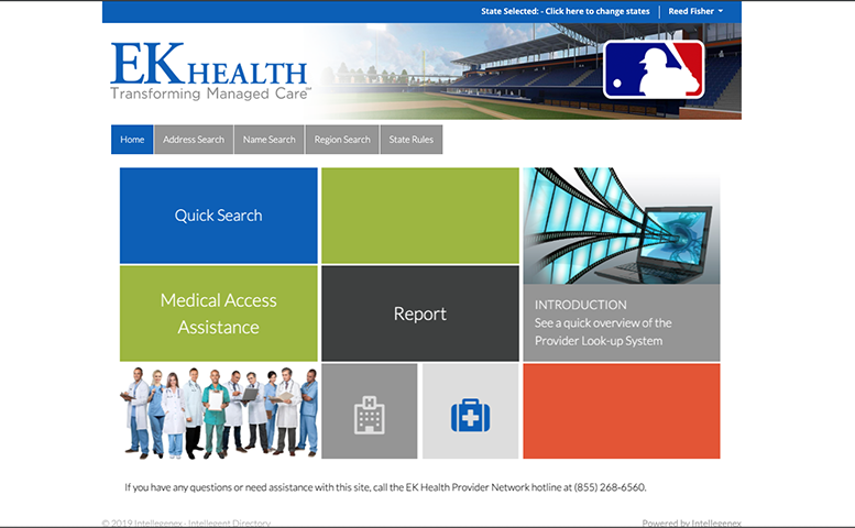
I was already familiar with the data having designed and produced a customer-facing look-up system using it. This look-up system was already deployed and in use by the one- or two-hundred users at and affiliated with the company.
The client was using Microsoft Excel® to work with their data. It was way less than ideal but it worked enough to get the company to a solid industry position.
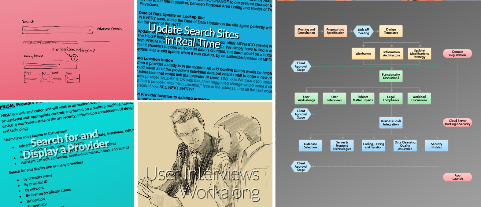
There were only a few users who would ever see and use the software, and I had full access to all of them, so I started there.
Interviewing and doing work-alongs with the users revealed how to proceed with the design.
I chose Angular as the framework for its feature set and continued with PostgreSQL as the data format; the lookups were already built on it. I had some ideas for enhancing the look-up systems which I’ll talk about later.
The information architecture was fairly straightforward as the data seemed to lend itself to logical clumps.
The basic app layout features data that is arranged similarly to the look-ups so that users could relate the two systems together.
I chose a feature of Angular where saving of data can be done “on blur” in order to reduce clicks. The users were a little reluctant at first but soon came to love the idea. When I offered to bring in a “Save” or “Confirm” button for each step the users instantly rebelled! They really appreciate saving those mouse clicks.
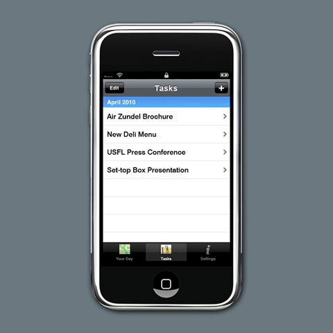
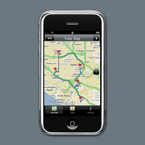
I generated a list of actions the users thought they would be using and created a main screen which would facilitate these. I had developers create a clickable prototype so users and the owners could get an idea of where we were going. This was received with enthusiasm by the users and the owners as the instant improvement to their Excel processes was very obvious.
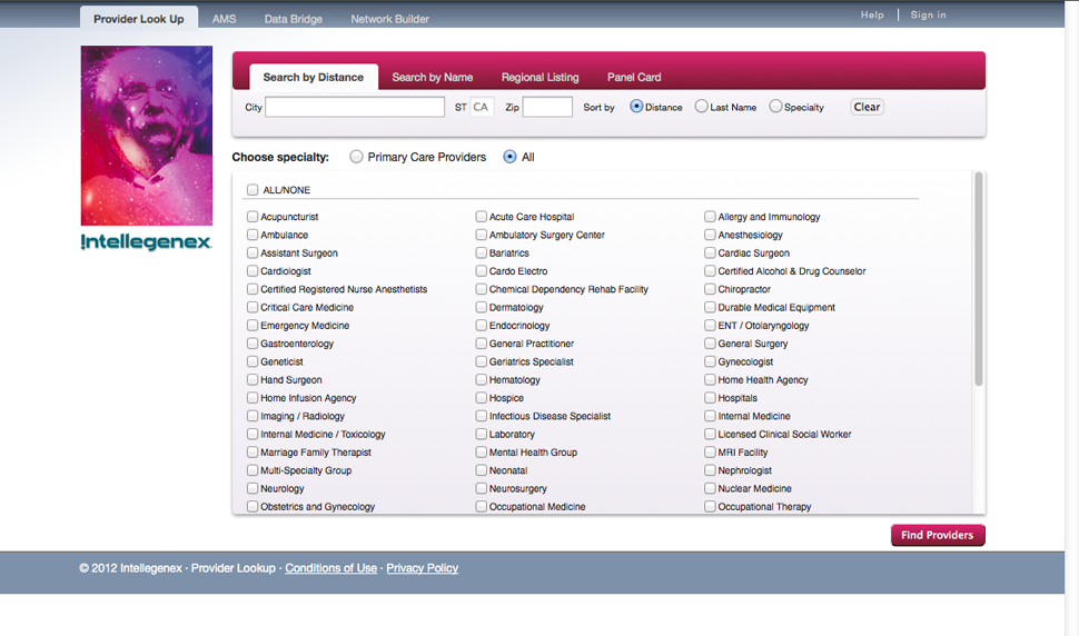
In the Worker’s Comp environment, it’s really important to only offer healthcare providers who are legitimately in network for the employer, and in good standing professionally. A critical action is to be able to deactivate a provider for any reason. I designed a method to automatically and instantly update the lookups from the software so that updates could be real-time, not waiting a week or more for a manual update.
The app is fully responsive and works nicely in both mobile and tablets. It runs on Microsoft Azure Cloud in the most powerful server and is really fast.
It provides a way to manage credentials of providers, or to accept delegated credentials as when an organization of providers, already credentialed, is added to a network.
It has “easy” contact management; put in as many contacts as wanted, select one to appear top-center.
Main actions have notes to explain or clarify. The notes have subject/purpose pull-downs for standardization so as to make the data more useful.
A provider or group can have attachment documents in any number.
Everything has a complete history. Advanced search is super-powerful.
The app is easy, easy, easy to use!
Wasted Time
I was charged with testing a new intranet site by the site owner, a very large tech company.
The site was attractive and consisted of over 600 screens of content plus tens of thousands of documents. It was a redesign of the existing site and the owners seemed anxious to be told that the designers had done a good job and that the site would assist in the important internal business of the company.
I took a neutral view.
It was, to me, like any other site and needed to prove to me that it would do what it intended to do. Like most intranet sites it had sections of company news, job descriptions, company rules and policies, calendars, employee phone list, Human Resources and related business.
The main “new” feature was a navigation system made of menus and submenus. It appeared that the design team had done a good job of information architecture and that the menu and submenus were logical and well organized. I was told the horizontal menu system would show much more of the page content, keeping out of the way of the “important” main page news and notices.
I noticed right away that clicking on one of the main column headers popped down a horizontal submenu, and the menu was aligned tightly up against the main menu. I also noticed that the submenu would retract instantly if the mouse cursor moved off its relatively thin strip. This was obviously a problem, as it takes time to re-acquire the main menu and its horizontal submenu, and then moving along the horizontal path was not going to get easier the second or third time it is attempted.
At the time, the company had about 350,000 employees in over 60 countries so the existing intranet site got a lot of traffic.
I took the prototype that had been given me and recreated the menu system in a duplicate set of pages. I then modified the copy to have vertical submenus instead of horizontal ones, and, I made them “sticky” — that is once open, the user would have to click an item on the menu, a different main menu item or something else off the menu system before it would retract.
I then wrote a test script of typical employee interactions with the site and started doing some quantitive testing of the two versions of the interface — three simple, common tasks for an employee for each version. I tested English-speaking employees all over the planet, using a screen-sharing system so I could watch the employee work with the site. I quickly found that the average time spent getting to the goals of the test script was considerably quicker with the vertical drop-down version versus the horizontal version due to the inadvertent retraction of the submenu.
The math showed that the proposed horizontal menu would cost the company more than a million dollars a month MORE than the vertical menu version in lost employee time, a pretty good case for an easy, simple re-design. The revised menu system was adopted.
Complex Requirements
In Worker’s Comp the employer of over 50 people (in most states) is required to provide free healthcare to employees for any injury or illness related to work.
The employer subscribes to a healthcare network of providers and in most cases the employee must use a provider from this network in order to take advantage of the “free” healthcare.
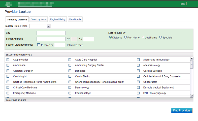
A list of a few of those providers within 15 miles or so is available to the employee as a poster in their break room. HR has a list of all the providers in the network which might total around 10,000 doctors, clinics, and hospitals in a large state like California. The provider network includes specialties allowed to be defined as Primary Care Providers as well as all the expected specialties in the healthcare industry.
Only Primary Care Provider types are allowed to accept a new patient or a previous patient for treatment. As needed, other specialties are engaged by referral from the Primary Care Provider.
This seems fairly straight forward, but in reality can be daunting for employees based on their circumstances.
In order for the Workers’ Comp system to work, many employers utilize Medical Access Assistants who are familiar with the regulations and the employer’s network, and can work directly with any employee to facilitate treatment and return to work.
A Medical Access Assistant need not hold any particular medical degree but must be familiar with the processes and rules of Workers’ Comp.
An issue that must be addressed is that the employee might need assistance and access to care at any given time, 24 hours per day, 7 days a week. No one person would be able to do that for an employee group so the employer usually engages a third-party service with 24-hour shifts available.
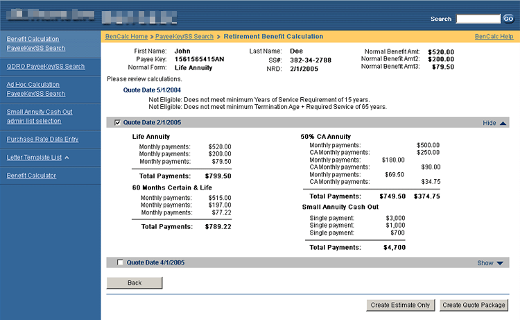
Here’s an example: Employee John Doe is injured at work — at 2:30 a.m. He calls his HR contact and she gets John to a clinic where John can be treated. HR also calls a Medical Access Assistant and gives him the employee’s name and contact information along with the name and contact info of the clinic where John is being treated.
The MAA, whom we’ll call Peter, logs the call and starts a record of his work with John. He calls John’s cell phone and introduces himself, offering his assistance. It turns out that John does not have transportation, so the MAA arranges an Uber pickup for John, and John is transported home at the end of his initial treatment.
The problem is that Peter’s shift ends at 6:00 a.m., so if John needs something else, who will fill in? How does the new MAA know about John and his treatment?
I designed software called MAA for this critical triage system. It is cloud based and responsive in layout so that any Medical Access Assistant in the system can access it via their mobile device, tablet, or desktop. When a call comes in from John at 10:00 a.m. that he is having a lot of pain and needs some help, the MAA on duty has a complete record of the interactions of the early morning and can pick up seamlessly where Peter left off. The second Medical Access Assistant, Jennifer, arranges for the additional treatment needed and John gets the help he needs.
The software stores the employee contact information, the employer, the treatment provided, by whom, when, and the body part treated. It has record slots for for the Adjuster, Attorney(ies), claim number, and notes. It allows attachment of documents to the claim, which stay with the record forever.
A Medical Access Assistant can add a task assignment to the claim to help another Assistant work with the claim.
Two or more claims for the same employee may be managed at the same time.
Any number of Medical Access Assistants can work a claim, and the full record is available to any of them or management at any time.
The software has full reporting capabilities such as Claim Activity by Employer, and Claim Activity by staff member.
To design the software I first met with a group of Medical Access Assistants and listened while they described how they did their important work. I then sketched user interfaces on the white board with them while noting requirements, needs and wants They requested that all the notes be on the same “page” as the form so as to be visible without leaving the page.
Then I created a clickable prototype with fake data so that the system could be demonstrated and “used” by the Medical Access Assistants. We iterated this process several times until we had a clear picture of how they worked and how the software could support that.
The software has an "instant access" line below the employee search box listing the past four employees who have been helped so that when the phone rings, the name of the injured employee calling for help will most likely be right there and instantly available. A single click then loads the claim and displays all the known information, including any notes and attached documents.
Any claim may be marked “Completed” and it is very simple to open a new claim. Only a first or last name of the employee, a contact method, and the insured (employer) need be entered for a record to be saved in the system. Employers are already in the system so that entering the employer is a simple “type-ahead” search.
A link to the employer’s Provider Network online search utility is included so that the Medical Access Assistant is always searching within network for the employee.
Samples
Many samples are proprietary and can't be posted. If you'd like to see more, please email me (Contact page).